8Bite: Turning Pop Culture Cravings Into an Event Night
4 weeks
Role
Designer, Strategist (Solo)

Project Goal
Cooking at home has never been more accessible… and yet most subscription meal kits feel flat, repetitive, and strangely joyless. At the same time, digital entertainment continues to shape culture and craving: anime meals, game-world snacks, and iconic fictional drinks feel more appetizing than whatever’s happening in most “healthy weeknight dinner” boxes.
8Bite started as a self-initiated concept exploring a simple question:
What if cooking felt like fandom?
Visual Exploration
Soft Home Cooking
80s Electric Energy
Late Night Coffee
A Logo That Isn't Just A Phase
- Controller Dropped — focus on food
- Donut “8” with a bite — literal and fun
- Script “Bite” — retro diner meets pixel punk
- Thicc curves — playful and punchy
Brand Identity
RAM Razz
#d9303e
Frostbyte
#4dbfb2
Night Sky
#1d1f22
Static Meringue
#eceef1

This palette supports two key needs:
-
High-contrast brand recognition
-
Edition flexibility


Bones of the Brand
8Bite’s mission to feed fandom, values rooted in contrast and chaos, and a vision that turns pop culture cravings into something craveable. It’s the blueprint for a brand built to break the mold and crash the algorithm.
Brand Mission
8Bite transforms fan-favorite recipes into real-world experiences that are as bold, fun, and unforgettable as the stories they came from.
Brand Values
We believe in creative chaos, unapologetic fandom, high-contrast visuals, and turning the ordinary act of eating into something extraordinary.
Brand Story
To bridge the gap between food and fandom. We cook up nostalgia with every bite, designing experiences where anime obsessions, video game cravings, and pop culture deep cuts find life on the plate. Whether it's a midnight snack from your favorite RPG or a comfort dish from a cartoon rerun, 8Bite makes the imaginary edible and unmissably delicious.
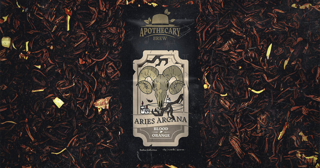
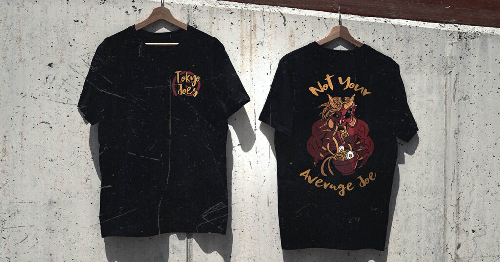
Iconic Mayhem
- Hand-drawn icons — Injected playful imperfection and fandom flair
- Food meets digital — Bridged culinary fun with digital energy
- Converted to art brushes — Enabled fast, flexible applications
- Offset Brush Settings — Created dynamic rhythm in layouts
- On-brand chaos — Reinforced the brand’s bold, high-contrast aesthetic


Eat with Your Eyes
- Street-Table Energy – Mixes natural shots with hyper-edited moments.
- High Contrast – Shadowy blacks, blinding brights, and punchy highlights.
- Color Pop – Bold reds, electric blues, vivid greens and neons demand attention
- Crunchy & Craveable – Textures and detail you can almost taste.
- Neon Nostalgia – Fluorescent ambiance meets food culture.
- Food as the Main Character – Plates get the spotlight, not the table.
Outcome


Results
1200
People Served
81
Customer Retention
92
Sell-Through Rate
What They’re Saying
Nectar Automotive Is the Future
Far far away, behind the word mountains, far from the countries Vokalia and Consonantia, there live the blind texts. Separated they live in Bookmarksgrove right at the coast of the Semantics, a large language ocean.
A small river named Duden flows by their place and supplies it with the necessary regelialia. It is a paradisematic country, in which roasted parts of sentences